Is Your Website Homepage Effective?
John M. Haddad
 When you search online for a new product or service, how often have you arrived at the site and asked “I don’t even know where to look for the info on this page or what I really want here?”
Unfortunately, it happens all too often. And even worse, it may be happening everyday on your small business website without you even knowing it. Just a few simple mistakes on your homepage can result in losing business.
Don’t panic. These tips will help you see what’s working on your site and what could use a little help. Put these tips to work, and you’ll be ready to make the most of every opportunity that lands on your website.
Make a Great First Impression
When you reach a website’s homepage, you should know within three to five seconds what the company does and what you can do on the site. Sounds easy enough, right?
That’s not always the case. Instead of keeping it simple, many business owners feel like they have to tell you every single feature and benefit of their product or service; like this is their one chance, and they had better tell it to you now, before they lose you forever.
However, by trying to cram all that information down your throat, these over-eager entrepreneurs actually can make your eyes glaze over and overload you with too much information. The result: opportunity lost. If your clients have to spend too much time trying to figure out what your company sells, they will be turned off and go to another website. The potential client should be able to figure out what your company is about on the first view of your homepage, without needed to scroll down the page too far.
On the other hand, some businesses go too far the other direction with just a single headline and the hope that you get it. That doesn’t always translate either, so strike a balance and don’t overwhelm or underwhelm your visitors. Focus on what pain points your product or service solves, instead of its features, and you can connect with your homepage visitors more effectively.
Make your contact forms simple
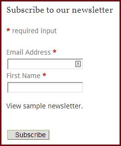 Ever go to a website to get sign up for an email newsletter or a free trial, or to have someone contact you, and find that you have to fill out a form with more 10-15 fields asking you for a lot of personal information? All they want is to be on your newsletter mailing list.
Here’s the best way to practice good form on your forms. Don’t attempt to collect every piece of information you want on the first shot. Yes, you want to know a lot about your visitor, but your visitor may only want—or have time—to give you a few pieces of information. You only need to have a few pieces of information (name, email, phone) to be able to contact them.
Plus, if you have more than three or four fields to fill out, your conversion rates (or the number of people who fill out your form, sign up, etc.) will start to drop off. Keep your forms simple. You can always gather more information as needed on subsequent contacts.
Make your homepage visually appealing
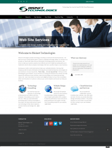 It’s critical that you catch your client’s eye with more visually appealing homepages. If you simply have a page with a lot of text, your readers will not get excited. People do not have time to read a lot of text when searching to see if your business is the right one for them.
Make your home page visually appealing with graphics and text mixed together. Having a large graphic in the header area and smaller graphic images scattered throughout the page draws their attention.
Make your pitch brief on the homepage, make sure you hit the key points of your products and services so they know exactly what you offer. You can always get into much more detail on your subsequent products and services page if they reader wants more details. You need to find a way to “hook” them so they will want more.
Summary
Over the past 16 years that we at Bisinet Technologies have been doing web design for our clients, many factors have changed that are driving new and more robust web sites to show up on the web. Computer screen sizes have increased. Many people are using high resolution tables and smartphones to view websites. Internet speeds have increased. Your clients are looking for a richer browsing experience than then did 4-5 years ago.
The key to a good homepage is to ensure that you are providing value and making your site’s user experience the best it can be. If your website is more than 4-5 years old, you may want to consider a redesign of your site. Contact us for a free consultation to discuss ways to enhance your site.
View other posts

Share this post
Recent Posts
